Analytics and Data Structures using AI · alternate explainer

The same data. Told two ways. Only one is remembered.

A companion to the storytelling rulebook — but instead of listing the rules, we tell the stories of the people who broke through with data, and let the rules surface on their own. Watch for the move at the end of each one.

Prefer the rules stated plainly first? See the 12-principle catalogue →

The bet behind this page

You could memorize twelve principles of data storytelling and still produce a deck nobody acts on. Rules tell you what good looks like; they don't show you the moment a chart turned into something a person couldn't put down.

So this page does the thing it's trying to teach. Each section below is a short, true story about a famous piece of data work — what the data looked like before anyone cared, what its author did, and why it landed. At the end of each, we name the single transferable move. By the last story you'll have rebuilt most of the rulebook yourself.

A data-only presentation tells you what was measured. A story tells you why you should still be thinking about it tomorrow.

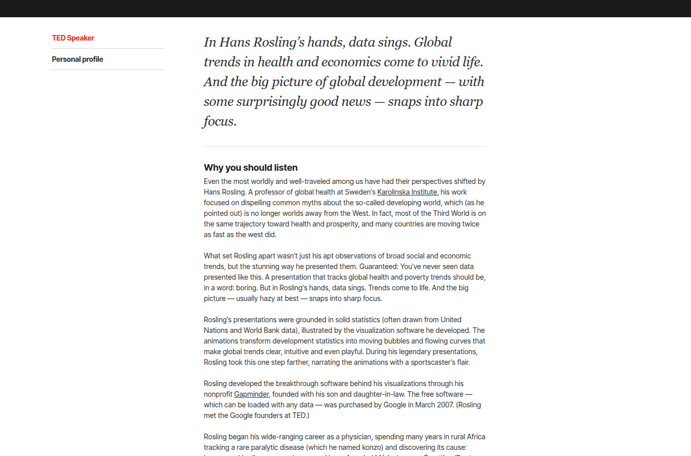
Hans Rosling presenting animated Gapminder bubble charts on stage
Rosling on stage: the chart is only half of it — the other half is a man narrating data like a horse race.

1 The professor who lost to chimpanzees

Hans Rosling presses play

Gapminder · Hans Rosling, TED 2006 onward · 200 Years That Changed the World

The setup. The data had existed for decades: every country's income and life expectancy, year after year, sitting in UN tables. Accurate, complete, and felt by no one. Educated audiences believed the world split neatly into "the West" and everyone else.

The provocation. Rosling opened by giving his audience a quiz about global health — and announced that chimpanzees picking answers at random would beat them. They did. The room's mental map of the world was simply wrong, and now they knew it.

The turn. He turned each country into a bubble — income across, lifespan up, population as size — and pressed play. Two hundred years streamed past in a few seconds. The poor, short-lived cluster crawled up and to the right, chasing the rich one. He called it like a sportscaster: "Here comes China… watch South Korea move."

Why it worked. Motion let people feel change instead of inferring it. The bubbles became characters with trajectories. And because he started from the misconception he meant to destroy, the data didn't just inform — it overturned a belief in real time.

The move

Start from the belief you intend to break, give every data point a body, and animate the change so the audience watches it happen rather than reads that it did.
contrast & surprisecharactersright mediumaudience
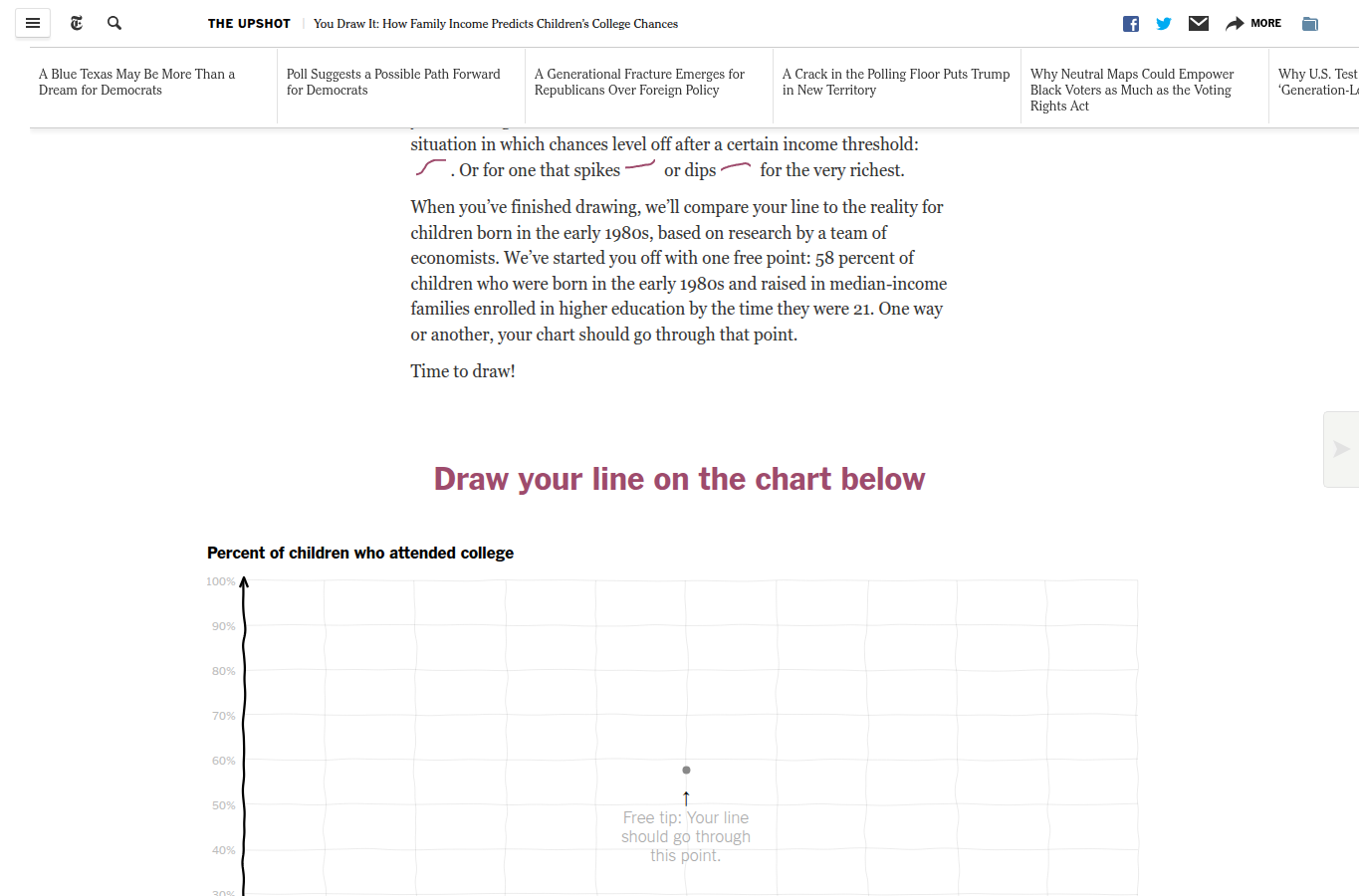
The New York Times You Draw It interactive about family income and college chances
You draw your guess first. Then the real line snaps in — usually steeper than you dared to predict.

2 The line you have to defend

The Times makes you commit to being wrong

The New York Times, The Upshot · You Draw It: How Family Income Affects Children's College Chances

The setup. The link between family income and a child's odds of finishing college is thoroughly documented. Drawn as a finished curve, it's one more inequality chart you nod at and scroll past.

The turn. The Times hid the answer and handed you a pencil. Draw what you think the relationship looks like. You sketch a line. Then the real data animates in — almost always far steeper than you guessed.

Why it worked. Your own wrong line becomes the benchmark, so the gap between guess and reality is the story — and it's personal. A number you were just beaten by is impossible to wave away as "another statistic." The interaction manufactures surprise honestly, out of your own expectation.

The move

Make the audience predict before you reveal. Their guess becomes the baseline, and the distance to the truth becomes a surprise they can't dismiss because they authored it.

lead with a claimcontrastconcrete stakesaudience
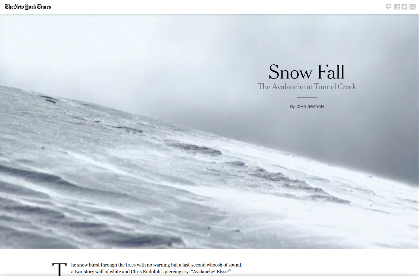
The New York Times Snow Fall scrollytelling project about the Tunnel Creek avalanche
Snow drifts across the screen as you scroll into the slope. The medium delivers each fact exactly when the story needs it.

3 When a newspaper made you scroll into an avalanche

Snow Fall turns a file into an experience

The New York Times, 2012 · John Branch · Snow Fall: The Avalanche at Tunnel Creek

The setup. Sixteen expert skiers, one mountain, an avalanche, three dead. The raw materials were a heap: interviews, weather records, terrain models, maps, victim profiles, animations. Stacked together they make a case file, not a story.

The turn. They sequenced it. As you scrolled, snow blew across the screen, the slope rendered in 3-D, and you met the skiers one at a time — before the mountain came down on them. The piece won a Pulitzer, and "to snowfall" briefly became a verb in newsrooms.

Why it worked. By the time the avalanche struck, you knew the people. The scattered evidence — terrain, weather, decisions, timing — was assembled into a single causal chain, and the medium revealed each piece only when the narrative was ready for it, never before.

The move

Sequence is meaning. Release terrain, characters, and evidence in the order the audience can absorb them — the order of the argument, not the order you happened to collect them.

analytic arccharactersguide attentionright medium
The Pudding essay on the inconsistency of women's clothing sizes
Follow one number — a "size 8" — across brands, and it stops meaning anything at all.

4 The label that lies

The Pudding proves it isn't you

The Pudding · Women's clothing sizes, investigated

The setup. The underlying data is dull: garment measurements by brand and labelled size. A spreadsheet of waists and hips. Nobody clicks on that.

The turn. The Pudding followed a single familiar unit — say, a "size 8" — across dozens of brands and showed it spanning a range of actual bodies wide enough to be useless. The size label became the character, and it behaved like an unreliable narrator.

Why it worked. It took a private, faintly shaming experience — nothing fits, must be me — and reattributed it to the data. The frustration the reader already carried became the hook, and one familiar number carried the entire argument.

The move

Anchor an abstract dataset to a frustration the audience already feels, then let one familiar unit do the arguing as it misbehaves in front of them.

concrete stakescharacterslead with a claim
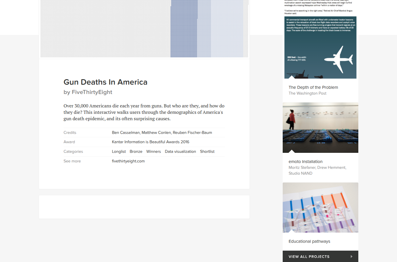
FiveThirtyEight Gun Deaths in America project with its dot-field visual
Roughly 33,000 dots break apart — suicides, then homicides, then by age and group — into the conversations they really represent.

5 When the honest number was the useless one

FiveThirtyEight breaks 33,000 apart

FiveThirtyEight · Gun Deaths in America · method

The setup. About 33,000 Americans die from guns each year. True, repeated everywhere — and it produced a stuck, generic argument, because one big number invites one big fight.

The turn. They animated the total breaking apart. Suicides peeled off first — roughly two-thirds of the deaths, a fact most people never picture. Then homicides, then splits by age, gender, and group, each fragment drifting into its own field of dots.

Why it worked. Segmentation converted one impossible problem into several addressable ones. Suicide prevention, domestic-violence intervention, and policing are different conversations with different levers — and the visual made that impossible to ignore. The story handed the audience groups it could actually act on.

The move

When a headline total hides the decision, break it into the groups a decision-maker can act on separately — the segmentation is the insight.

audienceend with actioncontextcharacters
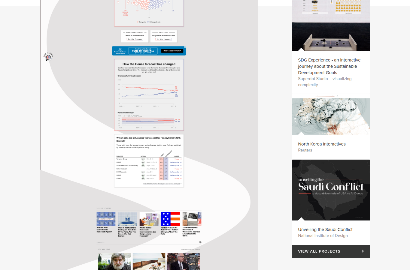
FiveThirtyEight election forecast showing a distribution of simulated outcomes
Not one number, but tens of thousands of simulated outcomes — the unlikely tail kept visibly in frame.

6 How to say "70% chance" without lying

The forecast that shows its own doubt

FiveThirtyEight · 2020 Election Forecast

The setup. A model spits out a single probability. Show "70%" on its own and half the room hears "will win," the other half hears "will get 70% of the vote." Both are wrong, and a 70% favorite that loses looks like a broken model.

The turn. Instead of the number, they showed the spread: tens of thousands of simulated elections, the unlikely outcomes drawn as visibly possible, and scenarios spelled out in words. The 30% wasn't a footnote — it was on screen, taking up space.

Why it worked. Uncertainty became the subject of the story rather than a disclaimer beneath it. Readers came away holding a sense of risk — a range of things that could happen — instead of a prophecy that would later feel betrayed.

The move

When a single number would mislead, show the distribution of possible outcomes and keep the unlikely ones visibly in frame. Make uncertainty the story, not the fine print.

keep uncertainty inright mediumethics
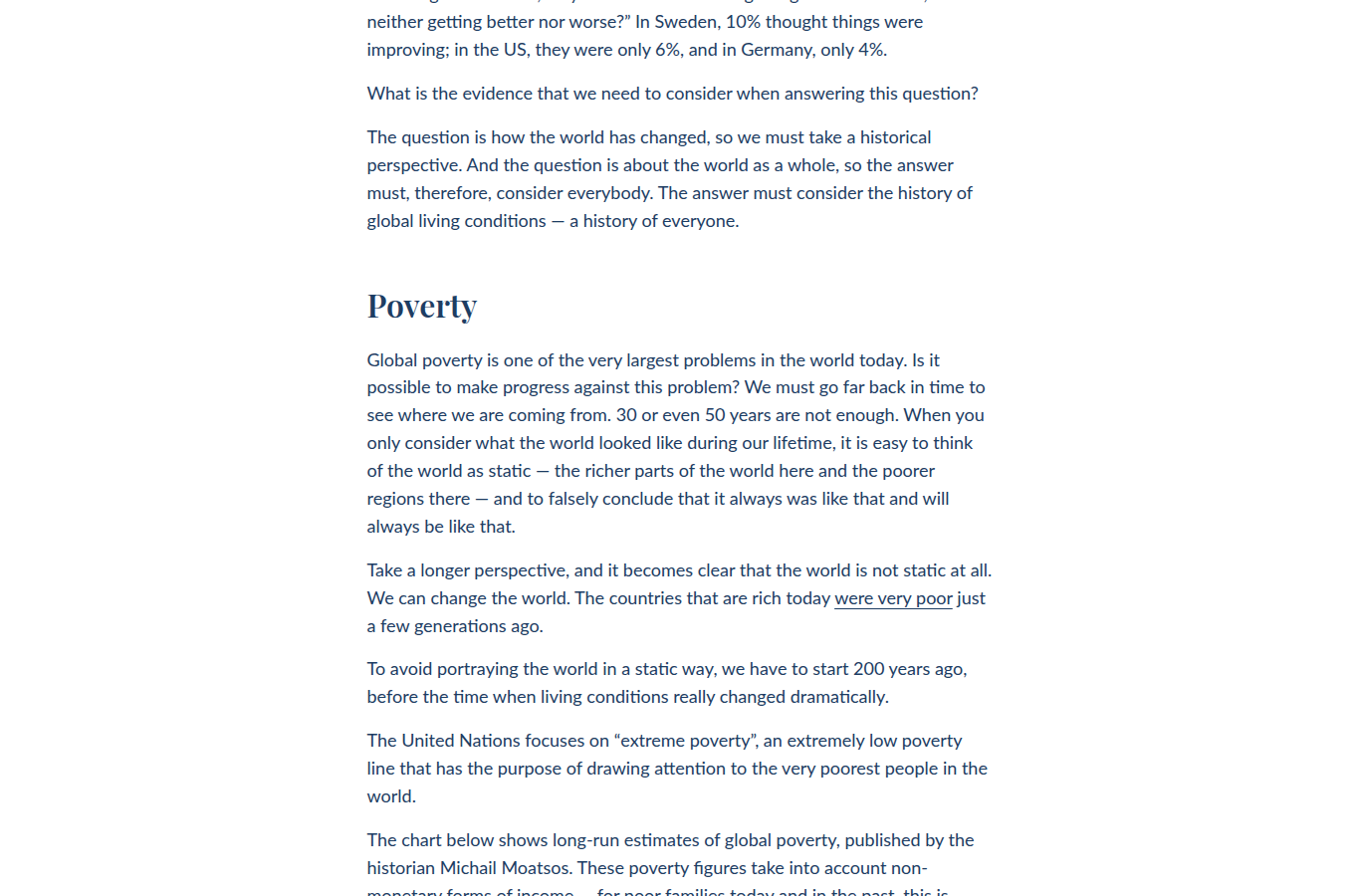
Our World in Data long-run living-conditions charts
Two centuries deep, with definitions and sources sitting right next to the claim — so a skeptic can check rather than dismiss.

7 The chart that argued with your pessimism

Our World in Data zooms out

Our World in Data · Max Roser and colleagues · A history of global living conditions in 5 charts

The setup. Ask people whether the world is getting better and most say no. The relevant evidence existed as separate indicators — poverty here, literacy there, child mortality elsewhere — each true, each too narrow to shift a worldview.

The turn. OWID set the long-run view side by side, two hundred years deep, and put definitions, sources, and downloads right next to each claim. The contrast wasn't between countries; it was between now and the whole sweep of the past.

Why it worked. Long-run context defused present-day panic without denying that progress is uneven and fragile. And because provenance sat where doubt naturally arises, a skeptical reader could verify the story instead of dismissing it — which, for a claim this counterintuitive, was the whole game.

The move

Before the detail, supply the baseline and the history — and place the sources exactly where a reader's doubt will surface, so trust travels with the claim.

context before detailcontrastethics

8 · Two quieter stories about trust

The flashiest move isn't always the point. Sometimes the story is whether anyone should believe you at all — and that, too, is craft.

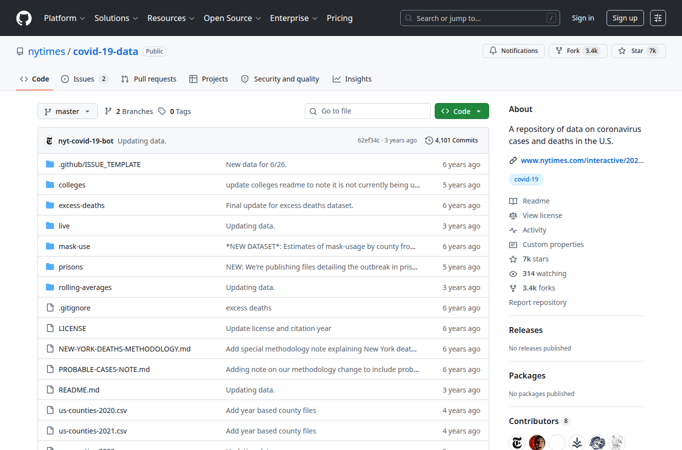
The New York Times COVID-19 data repository on GitHub

The newspaper that published its homework

The New York Times · covid-19-data repository

During the pandemic, case counts shifted daily with testing, reporting delays, and revisions. The Times didn't just chart the numbers — it posted the underlying data publicly, county by county, for anyone to inspect and reuse. The dataset became a national reference.

The move: when a decision rides on your chart, make the data behind it inspectable. Provenance becomes part of the story, and the caveats become honesty rather than weakness.

ethics & reproducibleuncertainty
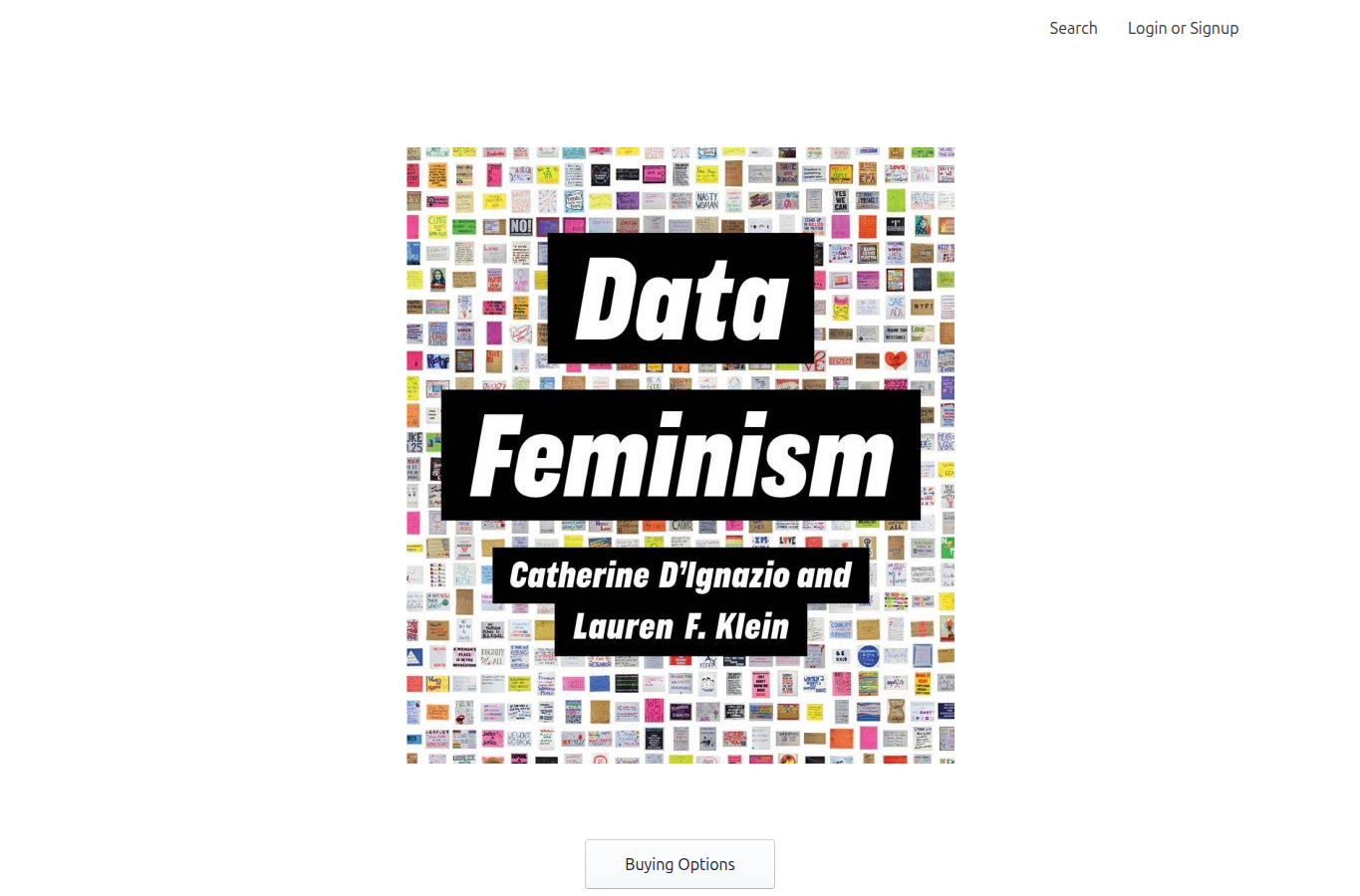
The Data Feminism book by Catherine D'Ignazio and Lauren Klein

The book that asks who's missing

Catherine D'Ignazio & Lauren Klein, MIT Press · Data Feminism

A chart can be technically flawless and still tell a partial story — because someone chose what to collect, what to count, and who to leave out. Data Feminism reframes those choices as the real story: who holds the data, who benefits from the conclusion, and whose experience never made it into the rows.

The move: a persuasive story carries power, so audit it. Ask who collected the data, who is represented, and who is absent — before you ask whether the math checks out.

ethics & poweraudience

The moves, named

You just watched the rulebook assemble itself. Here is every move from the stories above, paired with the principle it secretly was all along.

Break the belief first
Rosling opens with the quiz the chimps win, then overturns it
surprise · audience
Make them guess
You Draw It turns the reader's wrong line into the benchmark
claim · contrast
Sequence is meaning
Snow Fall releases evidence in the order of the argument
arc · attention
Give the data a body
Bubbles, skiers, a single size label become characters to follow
characters
Anchor to a felt frustration
The Pudding starts from "nothing fits" and reattributes the blame
stakes
Split the total into actions
FiveThirtyEight breaks 33,000 into separate prevention levers
audience · action
Show the spread, not the point
The forecast keeps the unlikely outcome visibly on screen
uncertainty
Zoom out before you zoom in
OWID supplies two centuries of baseline before the detail
context · contrast
Publish your homework
The Times posts the data; Data Feminism asks who's missing
ethics · reproducible

Want each principle stated directly, with side-by-side before/after demos? That's the companion page: the 12-principle catalogue →

Turn it back on the students

The fastest way to internalize these moves is to reverse-engineer one story and then build one. A 90-minute studio:

1 · Find the boring version

Pick any story above and write the one-sentence data-only headline its author rejected (e.g. "33,000 gun deaths per year"). Naming the dull version makes the move visible.

2 · Name the move

In a sentence, state what the author did to it — segment it, animate it, make you guess, zoom out. Compare with the table above only after committing to your own answer.

3 · Steal the move

Take a small dataset of your own (survey results, a class experiment, a public CSV) and apply that single move. Don't add three; add one and see what it changes.

4 · Tell it in 60 seconds

Present it aloud with one claim, one character, and one honest caveat. If a listener can repeat your point tomorrow, the story worked.

The stories, at their source

Every example above is real and worth showing in full. Open the originals — screenshots never do them justice.