Analytics and Data Structures using AI

Storytelling With Data

A teaching catalogue on turning evidence into communication. The page treats storytelling as disciplined argument, not decoration: every story-led example must stay accountable to data, context, uncertainty, and audience need.

12 principles

Data-only is not wrong. It is incomplete.

A data-only presentation says what was measured. A story-led presentation explains why the pattern matters, who is affected, what changed, what uncertainty remains, and what the audience should do next. The difference is not adding drama; it is adding structure and meaning.

DataWhat happened?
ContextCompared with what?
MeaningWhy does it matter?
ActionWhat should change?
1

Start With the Audience and Decision

A data story must be shaped around what the audience knows, values, misunderstands, and can act on.

Data-only

80
54
68
43

"Here are the retention rates for four cohorts." The audience must infer what matters, whether the numbers are good, and what choice is being requested.

Story-led

80
54
68
43

"If we must protect one cohort this month, Cohort D is the risk: its retention is 25 points below the target and the support team can intervene before Week 3."

Use in class

  • Name the audience before choosing the format.
  • Separate exploratory analysis from final communication.
  • State what decision, belief, or next question the story is meant to affect.
Ask: who can act after hearing this, and what exactly can they do?

Examples

FiveThirtyEight: Gun Deaths in America

Audience-Specific Exploration

Story: gun deaths are not one problem; suicide, homicide, age, gender, and race point to different prevention conversations.

public policyinteractive
Open project listing
Our World in Data topic pages

Questions for Public Understanding

Story: long-run public data can correct pessimistic or simplistic beliefs when charts are organized around human questions.

public datacontext
Open OWID
Datawrapper Academy

Chart Communication Practice

Story: a chart changes when it is designed for a reader's task, not the analyst's software output.

newsroompractice
Open academy
Open quick brief: examples explained

FiveThirtyEight gun deaths
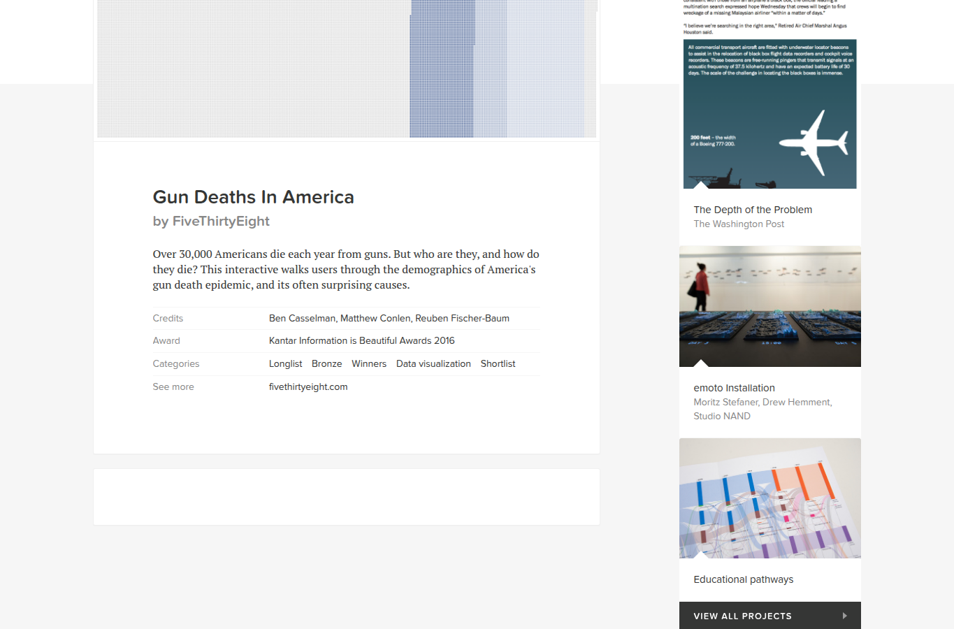
Screenshot of the Gun Deaths in America project listing and dot graphic
Screenshot of the Gun Deaths in America project listing and its dense dot-field visual.

Data-only version: "33,000 people die from guns each year" plus a table by cause, age, and race. It is accurate, but it invites a generic response because the audience sees one large problem.

Story-led version: the project makes the audience ask which deaths they are trying to prevent. Suicide, homicide, domestic violence, children, older men, and mass shootings require different interventions, so the story uses segmentation to create decision-relevant groups.

OWID topic pages
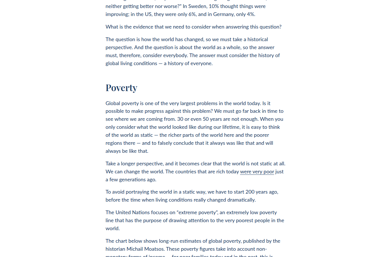
Screenshot of an Our World in Data chart page about global living conditions
Screenshot from an OWID long-run living-conditions page.

Data-only version: a searchable chart library of life expectancy, poverty, literacy, and mortality indicators. Useful for analysts, but not enough for a first-time reader.

Story-led version: OWID organizes the same evidence around public questions such as "are living conditions improving?" The page adds definitions, source notes, long-run context, and comparison so the audience can update a belief rather than merely inspect a chart.
2

Lead With a Claim, Then Support It

A story-led chart or report does not make the audience hunt for the point. It gives a defensible claim and then shows the evidence.

Data-only

Title: "Monthly Complaints, January to May." The chart has data, but no baseline, event marker, or reason to believe April matters.

Story-led

Title: "Complaints doubled after the April policy change." The stable Jan-Mar baseline makes the claim visible; the next slide should test other causes.

Use in class

  • Use action titles when the audience needs the takeaway quickly.
  • Keep claims proportional to evidence.
  • Make sure every paragraph, table, and visual supports or challenges the central claim.
Ask: is the headline a label, or is it a claim that can be checked?

Examples

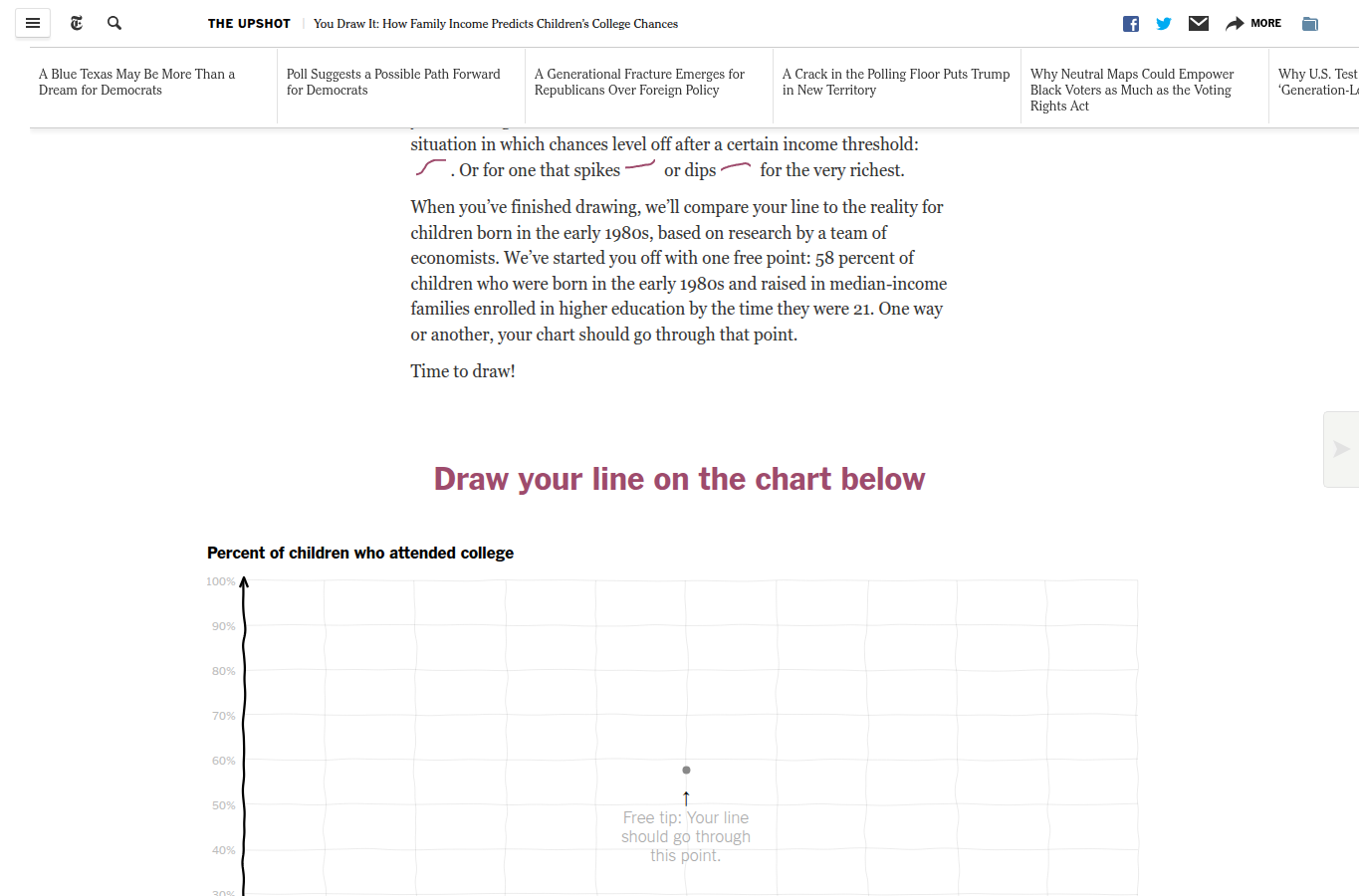
NYT You Draw It

Claim After Prediction

Story: most readers underestimate how strongly family income shapes children's college chances; drawing a guess makes the gap personal.

expectationinteractive
Open example
The Pudding: women's sizing

Sizing Chaos

Story: retail sizes look authoritative, but women's clothing labels are inconsistent enough that the label often says more about the brand than the body.

essayculture
Open essay
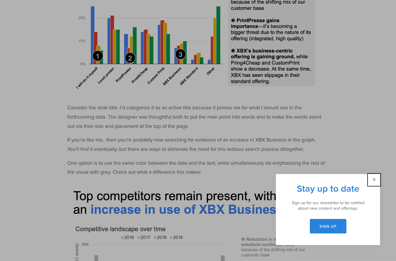
Storytelling With Data: slide title makeover

Connect Title to Graph

Story: the title should tell the audience what to see, and color should connect that sentence to the evidence in the chart.

makeoverbusiness
Open article
Open quick brief: examples explained

NYT You Draw It

Screenshot of the NYT You Draw It college chances graphic
The reader is asked to draw a line before seeing the real income-college relationship.

Data-only version: show the final curve of college attendance by parent income. The reader can see the relationship, but may treat it as just another socioeconomic chart.

Story-led version: the article first asks the reader to make a prediction. The claim is not merely "income matters"; it is "your intuition probably underestimates how much income matters." That expectation gap becomes the story engine.

SWD slide title makeover

Screenshot of Storytelling With Data slide title makeover article
A Storytelling With Data article on connecting an active slide title to the chart.

Data-only version: a slide title names the topic, and the audience must inspect the chart to infer the point. This wastes the most valuable part of the slide.

Story-led version: the title becomes a claim, and color connects that claim to the relevant marks. The viewer knows what to test, then the graph supplies the evidence.

3

Make the Stakes Concrete

Numbers become meaningful when the audience understands the consequence: money lost, time saved, risk reduced, people affected, or a belief corrected.

Data-only

"Missed appointments increased by 35%." True, but abstract.

Story-led

"The increase means roughly 140 unused appointment slots a month, equivalent to two clinician-days of capacity."

Use in class

  • Translate rates into units the audience can feel.
  • Connect the metric to a real operational or social consequence.
  • Use examples without pretending one anecdote is the whole dataset.
Ask: why should this audience care before the next meeting?

Examples

NYT You Draw It: college chances

Family Income as Stakes

Story: a child's chance of college is not only about effort; family income changes the odds in a way students can immediately understand.

educationmobility
Open example
The Pudding: women's sizing

Everyday Data Friction

Story: bad size labels create real costs: wasted shopping time, returns, frustration, and a false sense that the shopper is the problem.

retailstudents
Open essay
Gapminder: 200 years

Global Change With Human Scale

Story: countries did not move through history randomly; health and income improved together, changing what a normal life could be.

narrationglobal health
Open video
Open quick brief: examples explained

NYT college chances

Screenshot of NYT You Draw It college chances chart area
Education is a concrete stakes example because students can immediately interpret opportunity and constraint.

Data-only version: a percentage curve by family-income percentile. It tells us a relationship exists, but the consequence can remain abstract.

Story-led version: the reader sees that family background changes a child's chance of college. For GenWise students, the stake is not a distant policy debate: it is admission, mobility, family resources, and what "merit" can and cannot explain.

The Pudding women's sizing

Screenshot of The Pudding women's sizing essay
A familiar consumer problem becomes a data story about labels, bodies, and retail incentives.

Data-only version: measurements by brand and labelled size. It could be a technical apparel dataset with waist, hip, and size columns.

Story-led version: the essay connects those measurements to the experience of trying to buy clothes. The stake is time, confidence, returns, and the misleading implication that the shopper is wrong when the size label is unstable.

4

Build an Analytic Arc

A story has sequence: setup, tension, evidence, interpretation, and resolution. This is useful in a slide deck, article, notebook, or live explanation.

Data-only

Six charts appear in the order they were made during analysis. The audience receives outputs, not a path through the reasoning.

Story-led

Setup -> Surprise -> Evidence -> Choice

The sequence starts with the question, introduces the unexpected pattern, tests explanations, and ends with what follows.

Use in class

  • Start broad enough for orientation, then narrow to the decisive comparison.
  • Reveal complexity in the order the audience can absorb it.
  • Use a "martini glass" shape: guided story first, exploration afterward.
Ask: does the order of the evidence match the order of the argument?

Examples

Segel and Heer: Narrative Visualization

Narrative Structures

Story: narrative visualization has repeatable structures; you can guide readers first and still leave room for exploration later.

researchstructure
Open paper
EU data visualisation guide

Martini Glass Structure

Story: a "martini glass" starts narrow and guided, then widens into optional exploration once the audience understands the frame.

frameworkinteractive
Open guide
Snow Fall

Scrollytelling Arc

Story: an avalanche becomes understandable when terrain, weather, decisions, and people are sequenced together.

scrollytellingmultimedia
Open NYT project
Open quick brief: examples explained

Segel and Heer

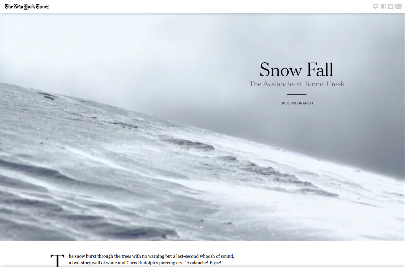
Screenshot of the Snow Fall scrollytelling project
Snow Fall is a useful visual reference for guided sequence and multimedia pacing.

Data-only version: a catalogue of interactive examples classified by chart type. That is useful taxonomy, but it does not teach how a reader moves through a story.

Story-led version: Segel and Heer describe narrative structures: author-driven slideshows, reader-driven drilldowns, and the martini glass, where the author guides the opening and then gives the reader room to explore.

Snow Fall

Screenshot of the opening visual of NYT Snow Fall
The first screen establishes place and tone before introducing the explanatory evidence.

Data-only version: maps, avalanche diagrams, weather readings, interviews, and video clips stored separately. Each may be accurate, but the reader must assemble the cause chain alone.

Story-led version: the project sequences terrain, weather, movement, people, and decisions. The arc turns separate evidence into an explanation of how the event unfolded.

5

Use Contrast, Change, and Surprise

Stories often begin when a pattern violates expectation: a gap opens, a ranking flips, a trend changes, or one group behaves differently.

Data-only

"Scatterplot of spend and conversion." The outlier is visible, but not explained.

Story-led

"Campaign E converted unusually well because it targeted returning users. That makes it a template, not just an outlier."

Use in class

  • Define the benchmark before declaring something surprising.
  • Use before/after, expected/actual, or group A/group B to create analytic tension.
  • Explain whether an anomaly is error, noise, or insight.
Ask: compared with what is this result interesting?

Examples

Gapminder myth-busting

Expectation vs Evidence

Story: viewers often carry outdated mental maps of the world; Rosling uses data to show that many countries moved faster than expected.

surprisemyth
Open article
NYT You Draw It

Surprise Designed Into the Story

Story: the reader's own guessed line becomes the benchmark, so the revealed data lands as a correction rather than a lecture.

contrastreader
Open NYT example
Our World in Data progress charts

Long-Run Contrast

Story: living conditions changed dramatically over generations, and long-run context prevents a present-only view of progress.

long-runchange
Open example
Open quick brief: examples explained

Rosling myth-busting

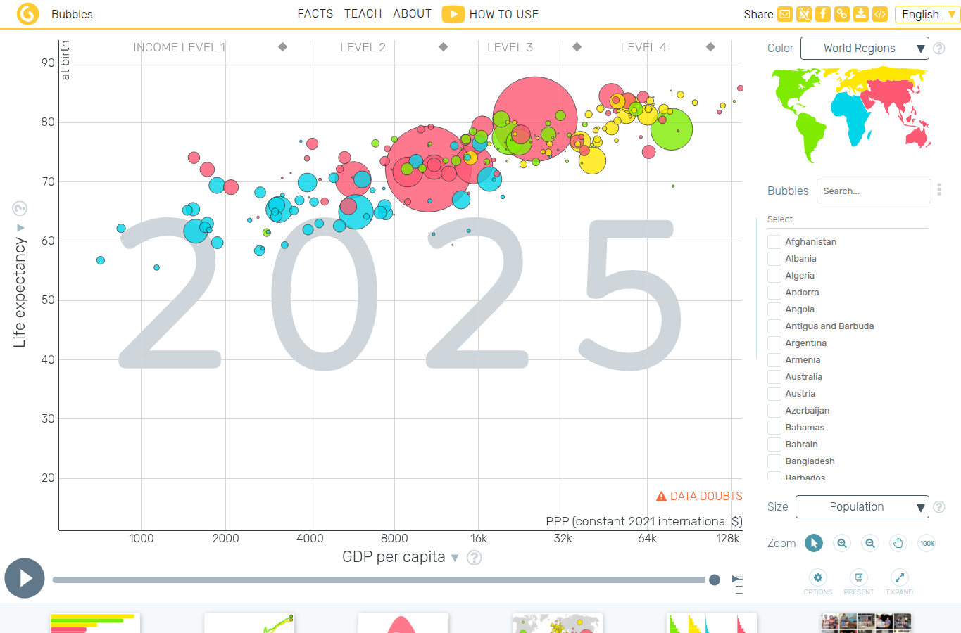
Screenshot of Gapminder bubble chart interface
Gapminder turns country-level data into motion, contrast, and surprise.

Data-only version: a bubble chart of countries by income and life expectancy. It contains the evidence, but the audience may not know what belief it should challenge.

Story-led version: Rosling often begins with a misconception, such as a fixed divide between "rich" and "poor" countries. The moving bubbles create contrast between expectation and historical change.

OWID living conditions

Screenshot of Our World in Data global living conditions chart
Long-run context lets the story contrast present anxieties with historical change.

Data-only version: one chart each for poverty, literacy, mortality, fertility, and democracy. Each chart says something true but narrow.

Story-led version: the page combines indicators to make a larger claim: living conditions have changed dramatically, but progress is uneven and fragile. The contrast is across time, not only across countries.

6

Give the Data Characters

A character can be a person, city, cohort, product, school, country, customer segment, or outlier. Characters help audiences follow change through time.

Data-only

"Average scores by region." The regions are categories, not participants in a pattern.

Story-led

"The northern region is the character to follow: it improved fastest after switching trainers, while similar regions stayed flat."

Use in class

  • Track one representative case through the evidence.
  • Use characters to make segments memorable without erasing variation inside them.
  • Avoid cherry-picking; explain why the chosen case is typical, extreme, or illustrative.
Ask: who or what does the audience follow through the story?

Examples

Gapminder country trails

Countries as Characters

Story: countries become characters moving through health and wealth, making national trajectories easier to remember.

countriestime
Open tools
NYT Snow Fall

People and Terrain

Story: people, terrain, weather, and timing combine into one causal account of why the avalanche became deadly.

human storyplace
Open project
The Pudding: women's sizing

Size Labels as Characters

Story: size labels become characters with inconsistent behavior across brands, exposing why shoppers cannot treat one label as truth.

culturenarrative
Open essay
Open quick brief: examples explained

Gapminder countries

Screenshot of Gapminder country bubbles
Countries become trackable characters when the viewer follows their paths through time.

Data-only version: a cloud of points where each country is one mark. The data are rich, but every country competes for attention at once.

Story-led version: the teacher chooses one or two countries to follow. Their movement creates a character arc: where they started, when they changed, whether they diverged from neighbors, and what might explain that path.

The Pudding essays

Screenshot of The Pudding women's sizing graphic
In the sizing essay, the "character" is the size label itself as it behaves differently across brands.

Data-only version: a table of garment measurements by brand. It is informative, but students may not know what to follow.

Story-led version: a size label becomes the character. The reader follows how a familiar label shifts across brands and learns that the label's authority is weaker than it appears.

7

Add Context Before Detail

A number needs a denominator, baseline, history, definition, and comparison before it can carry a story.

Data-only

42,000

"The city recorded 42,000 cases." Without population, testing, time window, and comparison, the number floats.

Story-led

42,000 cases
18% below last winter

"Cases are still high, but the city is below last winter's peak after adjusting for population and testing volume."

Use in class

  • Define measures in ordinary language.
  • Use rates when exposure differs across groups.
  • Give enough historical context to prevent overreacting to one period.
Ask: what denominator or baseline is missing?

Examples

FiveThirtyEight gun deaths methodology

Explaining Data Limits

Story: the gun deaths project explains what the data can and cannot say before readers use it to reason about prevention.

methodlimits
Open methodology
OWID Grapher

Definitions and Sources Nearby

Story: a reader should not have to trust the chart blindly; definitions, sources, and downloads sit beside the claim.

sourcecontext
Open Grapher
Datawrapper: responsible maps

Normalize Before Story

Story: a map's message depends on normalization and color choices; raw counts can tell the wrong geographic story.

mapsrates
Open guide
Open quick brief: examples explained

FiveThirtyEight methodology

Screenshot of Gun Deaths in America project with project description
Method and framing are part of the story because they tell readers what the evidence can support.

Data-only version: the graphic is presented as if the dataset is self-explanatory. Readers see patterns but not the definitions, exclusions, or limits.

Story-led version: the methodology explains where the data comes from and why the story groups deaths the way it does. That context prevents readers from overgeneralizing a single count.

Datawrapper choropleths

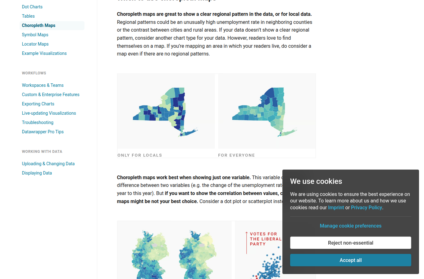
Screenshot of Datawrapper choropleth map guidance with map examples
Datawrapper shows how map choices change the story a reader sees.

Data-only version: put values on a map because the data has locations. This can accidentally tell a population-size story or a land-area story.

Story-led version: the map is used only if geography is part of the question. Rates, bins, palette, and notes are chosen to support the intended interpretation rather than decorate the data.

8

Guide Attention Deliberately

Storytelling is editing. Highlight what matters now, dim what is context, and reveal complexity only when the audience is ready for it.

Data-only

Everything is equally dark, equally labeled, and equally important. The reader must scan without guidance.

Story-led

The decisive value is highlighted, the rest remains as context, and an annotation explains why it matters.

Use in class

  • Use color, annotation, sequence, and layout as attention controls.
  • Remove visual noise that does not support the current point.
  • Use progressive disclosure for complex charts and dashboards.
Ask: where does the viewer look first, second, and third?

Examples

Storytelling With Data: focus makeover

Before/After Attention Design

Story: a chart becomes persuasive when the design tells the audience where to look and why that mark matters.

annotationfocus
Open article
NYT Snow Fall

Guided Visual Journalism

Story: scroll sequence turns a complex event into steps, revealing terrain, people, and evidence only when needed.

journalismsequence
Open project
Datawrapper annotation guides

Labels as Guidance

Story: annotations reduce the distance between seeing a pattern and understanding its meaning.

labelsclarity
Open guide
Open quick brief: examples explained

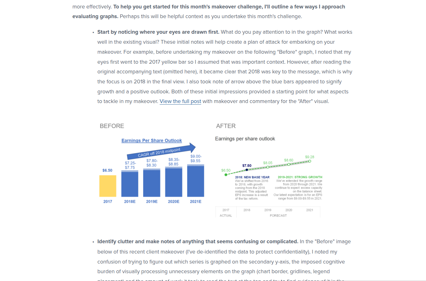
SWD makeovers

Screenshot of a Storytelling With Data graph makeover challenge
Before/after makeover material is useful for teaching attention control.

Data-only version: every mark is equally prominent, the title names the topic, and the reader must decide what deserves attention.

Story-led version: the designer chooses a reading path. Color, label placement, and title make the central pattern easy to notice while the rest of the chart remains available as context.

Datawrapper annotation

Screenshot of annotated Datawrapper map guidance
Labels and notes reduce the distance between seeing and understanding.

Data-only version: the chart is correct but silent. The reader sees marks, legends, and axes, then does all interpretation alone.

Story-led version: annotations point to the relevant feature at the relevant moment. This is especially useful in class because it models how to read the chart, not just what the chart says.

9

Keep Uncertainty in the Story

A story that removes caveats may be easier to tell, but less true. Uncertainty should be part of the explanation, not hidden in a footnote.

Data-only

"The model predicts 74." No range, no confidence, no conditions, no failure modes.

Story-led

Most likely: 74
plausible range: 61-88

"The forecast points upward, but the range is wide enough that staffing should be planned in two scenarios."

Use in class

  • Distinguish measurement uncertainty, model uncertainty, sampling uncertainty, and unknown future behavior.
  • Use scenario language when precision would mislead.
  • Do not bury limitations that would change the decision.
Ask: what part of the story could turn out differently, and how would we know?

Examples

FiveThirtyEight forecasts

Simulation as Story

Story: a forecast is a set of possible futures; showing many outcomes prevents a single-number prediction from sounding certain.

probabilityforecast
Open showcase
NYT COVID uncertainty interview

Questions Before Certainty

Story: COVID charts had to admit what was unknown while still helping readers make sense of changing evidence.

uncertaintypublic health
Open article
NYT COVID data repository

Revisions as Part of the Story

Story: public COVID numbers changed with reporting systems, revisions, and definitions, so provenance is part of uncertainty.

public datarevision
Open repository
Open quick brief: examples explained

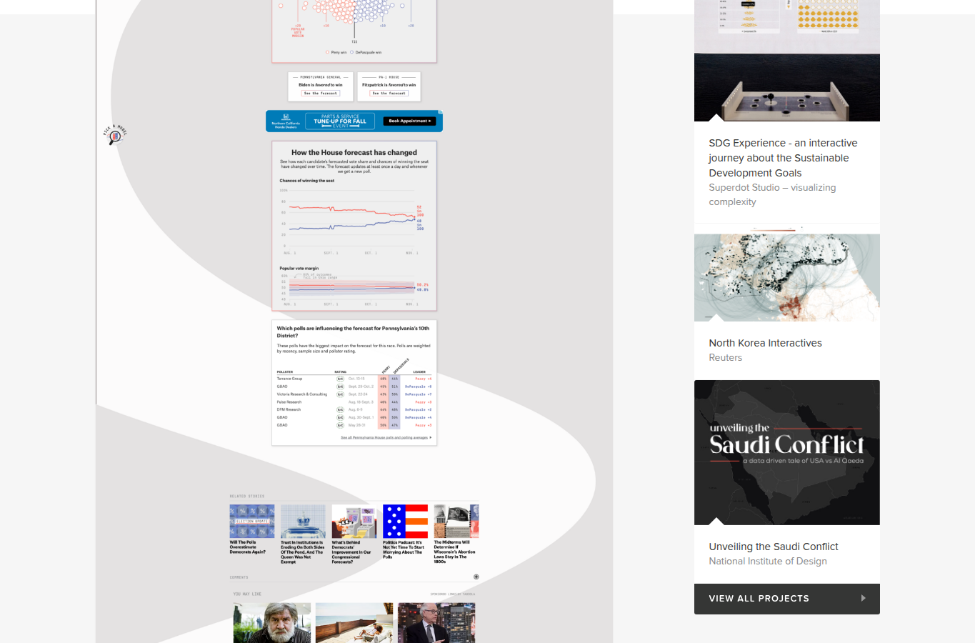
FiveThirtyEight forecast

Screenshot of FiveThirtyEight election forecast showcase
Forecast storytelling should show many possible outcomes, not only the most likely one.

Data-only version: "Candidate A has a 70% chance." Many readers misread that as a certain prediction or a projected vote share.

Story-led version: simulations, ranges, and scenario language make uncertainty visible. The audience learns that a less likely outcome can still happen, so the story is about risk, not prophecy.

COVID uncertainty reporting

Screenshot of the NYT COVID-19 data repository
Public data repositories help explain uncertainty, revision, and measurement limits.

Data-only version: a case line rises or falls without showing testing changes, reporting delays, or later revisions.

Story-led version: the explanation tells readers what is known, what is provisional, and what could change. The caveat is not hidden; it is part of the story's honesty.

10

Choose the Right Medium

Data stories can be memos, slides, dashboards, articles, talks, videos, notebooks, or conversations. The best medium fits the audience's task and attention.

Data-only

90
72
48

The same dense dashboard is used for executives, analysts, students, and public readers.

Story-led

Memo for decision
Dashboard for monitoring
Notebook for audit

The communication is split by job: concise recommendation, live monitoring view, and reproducible detail.

Use in class

  • Use a table when exact lookup matters.
  • Use a slide or memo when a decision is needed.
  • Use a dashboard when repeated monitoring matters.
  • Use scrollytelling or video when sequence and explanation matter more than lookup.
Ask: is the audience exploring, deciding, auditing, or learning?

Examples

Hans Rosling talks

Live Performance Plus Data

Story: live narration can pace attention, challenge misconceptions, and make a multivariate chart feel like a journey.

talkanimation
Open TED profile
Observable D3 gallery

Notebook as Explanation

Story: for technical audiences, the notebook itself can be the story because code, data, and chart are auditable in one place.

notebookcode
Open gallery
NYT Snow Fall

Article-Graphic Hybrids

Story: some topics need text, chart, map, and interaction together because no single medium carries the whole explanation.

articlehybrid
Open project
Open quick brief: examples explained

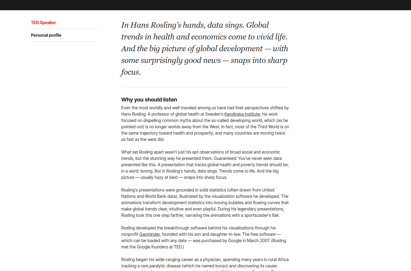
Rosling talks

Screenshot of Hans Rosling's TED speaker page
Rosling's medium is not just the chart; it is chart plus performance, timing, and narration.

Data-only version: publish the Gapminder chart and let the audience explore. This works for motivated readers but may not correct misconceptions quickly.

Story-led version: a live talk controls pacing. Rosling introduces the misconception, animates the evidence, names the surprise, and uses voice and gesture to keep attention synchronized with the data.

Observable notebooks

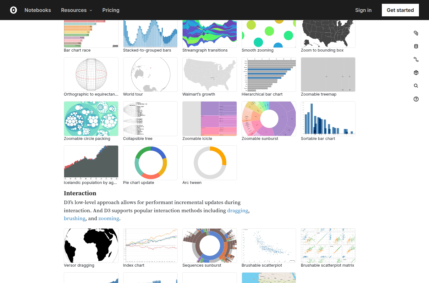
Screenshot of Observable D3 gallery
For technical audiences, the medium can expose both chart and construction.

Data-only version: a static exported chart. It communicates the result but hides the recipe.

Story-led version: a notebook combines explanation, code, data, and output. That medium is better when students need to audit the method or adapt the example.

11

End With Decision, Implication, or Next Question

A strong data story does not merely stop. It lands: act, monitor, investigate, stop doing something, or revise a belief.

Data-only

"Here are three possible interventions and their expected effects." The communication ends at display.

Story-led

"Choose Intervention B for the pilot, because it has the largest expected effect and the lowest setup risk; review after 30 days."

Use in class

  • Separate findings from recommendations.
  • State what should happen next and what evidence would change the recommendation.
  • For exploratory work, end with a better question and a concrete plan to answer it.
Ask: after this story, what changes?

Examples

FiveThirtyEight gun death prevention

From Pattern to Prevention

Story: if gun deaths have different causes, the action cannot be generic; prevention must match the subgroup and mechanism.

actionpolicy
Open article
Public health data storytelling guide

Data to Communication Plan

Story: data communication should move from evidence to a specific public-health action, not stop at a chart.

healthguidance
Open PDF
Datawrapper maps and charts

Operational Clarity

Story: the title and notes can turn a monitoring chart into a recommendation or next step.

titledecision
Open academy
Open quick brief: examples explained

Seven prevention conversations

Screenshot of Gun Deaths in America project summary
The action changes once the story separates causes and affected groups.

Data-only version: rank gun deaths by cause or demographic group. The audience learns the size of categories but not what to do with them.

Story-led version: the story turns the categories into separate prevention conversations. A suicide-prevention intervention, a domestic-violence intervention, and a policing intervention are not interchangeable.

Public-health storytelling guide

Screenshot of public-facing map guidance
Public-facing data stories need to land on a decision, behavior, or next question.

Data-only version: report indicators and stop. The audience may understand the problem but remain unsure what response is expected.

Story-led version: the communicator names the audience, the message, the evidence, and the action. In class, this is the difference between "interesting analysis" and "usable communication."

12

Stay Ethical, Transparent, and Reproducible

Storytelling increases persuasive power, so it also increases responsibility. Do not cherry-pick, hide uncertainty, erase affected people, or imply causality without evidence.

Data-only

78
22
71

A chart is shown without source, filters, missing data notes, or reproducible method.

Story-led

Source + method + caveats + affected groups

The story includes provenance and limitations, so the audience can trust, audit, and challenge it.

Use in class

  • Preserve source links, data dates, transformations, and code where feasible.
  • Represent affected people with care, especially in health, crime, education, and poverty topics.
  • Flag uncertainty and missingness in the main story when they change interpretation.
Ask: what would a skeptical, informed reader need to verify this story?

Examples

NYT COVID-19 data repository

Public Data Infrastructure

Story: a public COVID tracker became more trustworthy because the data behind the story could be inspected and reused.

repositorypublic data
Open repository
FiveThirtyEight data

Story Data Downloads

Story: releasing story datasets lets readers check whether the narrative survives independent scrutiny.

dataaudit
Open data
Data Feminism

Power and Data Stories

Story: data stories reflect power; ethical storytelling asks who collected the data, who benefits, and who is missing.

ethicspower
Open book
Open quick brief: examples explained

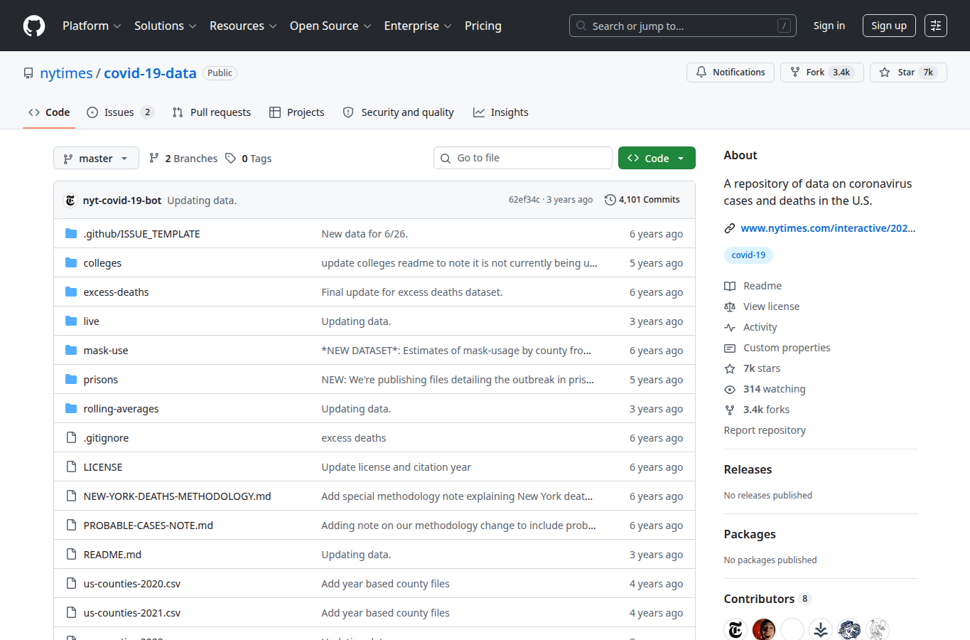
NYT COVID repository

Screenshot of the New York Times COVID-19 data repository on GitHub
The data behind a public story becomes part of the communication.

Data-only version: a dashboard asks the reader to trust the numbers. If the source and definitions are hidden, the story is difficult to audit.

Story-led version: publishing the data lets others inspect, reuse, and challenge the evidence. Provenance becomes part of the story, especially when decisions depend on the chart.

Data Feminism

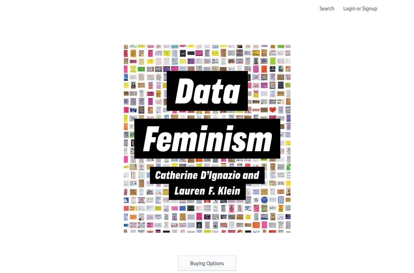
Screenshot of the Data Feminism book page
Ethical storytelling asks who the data serves and who it leaves out.

Data-only version: ask whether the chart is technically correct. That is necessary, but not sufficient.

Story-led version: also ask who collected the data, who is represented, who is missing, and who gains power from the conclusion. Persuasive data stories need this audit because storytelling increases influence.

Source Notes

These links are included for classroom attribution and follow-up reading. Some are examples; others are frameworks or practice guides.